Relieve
“An app that provides stress-relief activities from work”
Role:
Product Designer
Tools:
Sketch, InVision, Miro
Deliverables:
UX Research, User Flows, Sketches, Wireframes, Usability Testing, High-Fi Screens, Prototype
Timeline:
April 2021 - October 2021 (6 months)

Define
Project Overview:
The COVID-19 Pandemic has forced many workers to work from home. In May 2020, around 35% of all employees started working remotely or at home*. Conflict that usually stay at the office have started to influence their home life. As a result, stress levels have increased due to this work-life balance change.
Problem Statement
Employees want a way to destress but it’s hard for them to implement time management.
Solution:
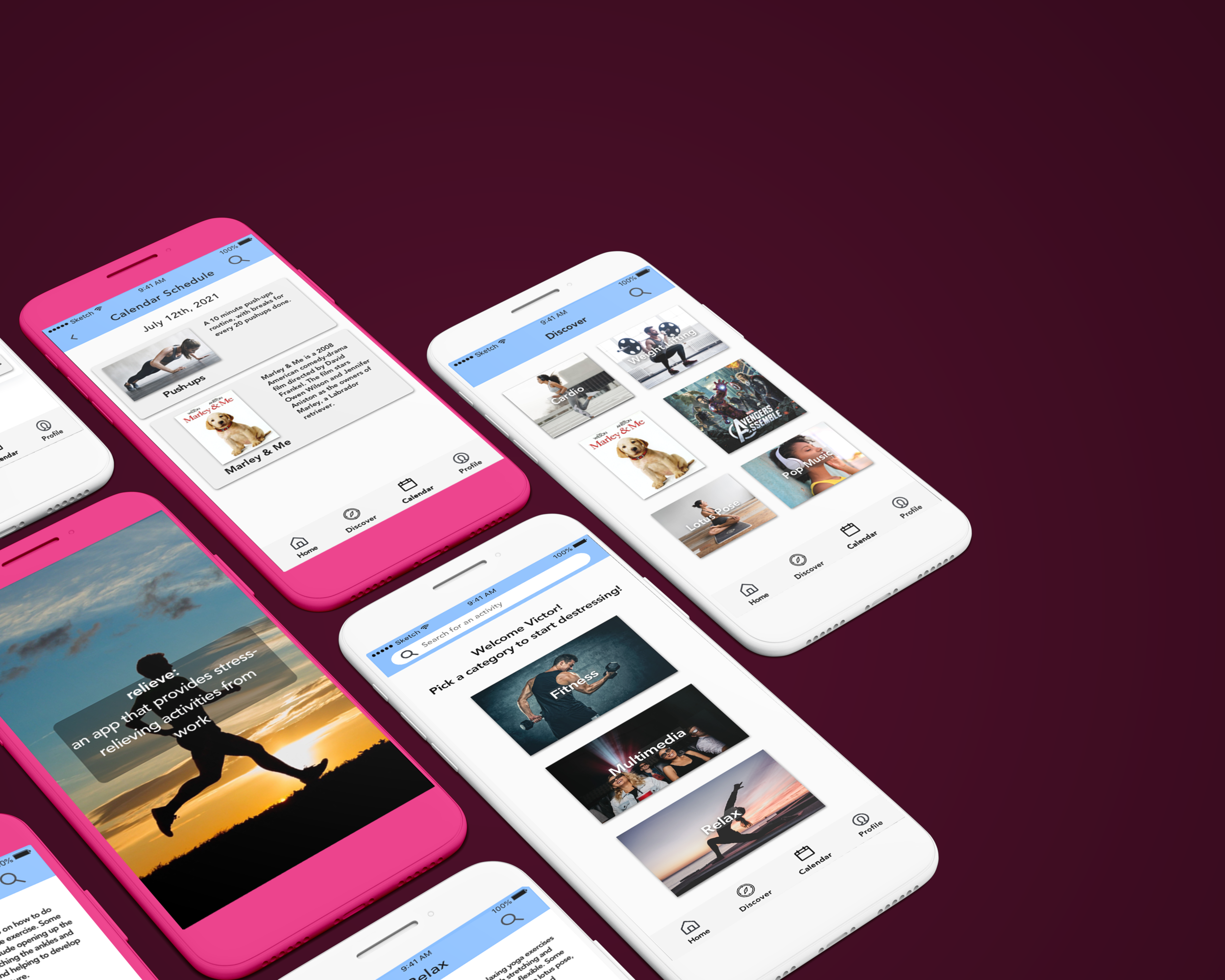
Relieve is a mobile app that helps reduce stress through activities such as fitness, yoga, and movies/tv shows. Users are able to schedule specific events into their mobile calendar to be reminded through push notifications. The goal is for remote employees and freelancers to destress after a long day of work.

Research
Surveys
To see what my target audience thought about my idea and solution to destress, I conducted a survey. Over a two-week period (April 27th to May 2nd, 2021), I had 27 participants.
Some survey research insights:
Highest used methods to destress are watching movies/tv shows, eating/cooking, and exercising.
Time management is the #1 struggle when working from home.
Stress/Anxiety and Communication issues are the #2 and #3 struggles with working from home.
Click on image to enlarge.
Click on image to enlarge.
One of my interview participants!
Interviews
After the survey results, 8 participants were interviewed for 30 minutes to ask more in-depth questions on their experience on relaxing from work.
Interview Observations
Most stress at work is caused by lack of communication, time management, and long hours.
“Work can be stressful while under a time crunch” ~ Participant
Most people prefer spending time with friends/family to destress.
Exercising was the next most popular way to destress.
Interview Insights
Most people thought taking time to talk with people relieves stress
Pandemic: “Being alone… extroverted time is important”
Some people found exercising helps relieve stress and exerts physical energy
Some used meditation & yoga to distract the user from stress
Similar effect for Netflix and TikTok
Research Synthesis
I chose to represent my research through a persona and an affinity map. Both synthesis techniques enabled me to dive deeper into my user’s needs, problems and goals.
Click on image to enlarge.
Click on image to enlarge.

Ideate
Site Map
After researching the users, I created a preliminary site map for my mobile app.
Categories include: Relax, Social, Fitness, Recommended, Entertainment, and Settings.
Click to enlarge image.
Click on image to enlarge.
User Flow
For the Relieve App, the main goal was to establish an easy method to choose stress relief activities. The easiest way to do this was to choose between three main categories: Relax, Fitness, and Entertainment.
Sketches
Before jumping into wireframing, I decided to sketch out my designs to see what they would look like on paper. On the left image, the top three screens show the search function red route. The bottom three screens are the basis of what will be the onboarding stage.
On the right image, I included the three main categories (Fitness, Entertainment, Relax) for the second red route. The user can navigate between the different activity recommendations before adding them to their calendar.
Wireframes
For these wireframes, I created the onboarding screens and 2 red routes. One main path is dedicated to the activity mobile screen. The other is how the user searches for activities using the search button. The basic layout of the app is to have three categories for Fitness, Entertainment, and Relax. Each category includes subcategories for activities. For example, Yoga is under the Relax category. From there, the user can play the activity video or add it to their calendar.
Click on image to enlarge.
Usability Test 1
For my first Usability Test, I had 8 participants from their 20s-40s. Some insights include:
Nearly all participants commented on the lack of a confirmation screen after booking an activity.
The calendar screen did not have a time option before, only a frequency option.
More guidance on the home screen (e.g. text that says “Choose a category to destress”)
Higher contrast between the category text and the images.
Include a larger search icon.
Usability Test 2
For the second Usability Test, I had another 8 participants from ages 20s-40s. Some of their feedback were:
More calendar functions within the app.
Have a list view for the activities.
Being able to edit current calendar events.
Fix the lining on the navigation icons.
Add achievements or other methods of gamification.
Add search bar to the home screen.
Usability Test
Ft. One of my participants
Prototype
For this High Fidelity Red Route, I chose to add an activity by category. The user clicked on Relax and then chose the Yoga sub-category. On the next screen, the user is able to see the Yoga Activity and play the video to learn about the Lotus Pose.
I added high-quality photos for the categories and activities to create a deep contrast with the rest of the screen. For the navigation, I included icons for Discover, Calendar, and Profile. The light blue color for the banner provides a little color to an otherwise black, white, and gray color scheme. And I used white text for the category titles to ensure a clear contrast between the photos.
The user can add the activity to their calendar and choose the start & end time. After that, the user can see a confirmation screen to confirm that the activity has been added to their calendar.

Conclusion
Reflections and Future
The 6-month journey that I spent developing this mobile app has been very rewarding. The process of defining, ideation, and iteration has changed the way I tackle projects as a Product Designer.
For future iterations, I would include the following:
It would be nice to redesign the calendar portion of the mobile app. I want to see if I can come up with a better way to display the activities a person has scheduled routinely.
It would also be good to develop more features for the app, like customizable routines or other personalized settings.
In my spare time, I hope to add these features along with other changes for this mobile app. Look forward to it!
*Statistic taken from the BLS Current Population Survey, Supplemental data measuring the effects of the coronavirus (COVID-19) pandemic on the labor market.


